Computation of Relative Rigor Score (RRS)
Basic Principles
There are many ways to conduct science, and RESQUE does not give a precedence to any approach. For example, it does not favor confirmatory research over exploratory research. But whatever approach you choose, it should be done well. So we created quality indicators for different aspects.
Importantly, you should not be penalized if certain points cannot be achieved in principle. Therefore, we compute the Relative Rigor Scores as a POMP (Percentage of Maximum Points): If an indicator is justifiably ‘not applicable’, the indicator is taken out of the set, the maximum score is adjusted accordingly, allowing for the possibility of achieving 100% of the applicable points.
Equal weighting of research outputs
For the computation of the overall RRS score, all submitted research outputs are weighted equally. That means, if two publications are available, each publication contributes 50% to the overall score, even if they differ in their maximally attainable points. The reasoning is that it should not be punished if some points cannot be obtained in principle. With our POMP (“percentage of maximum points”) computation, it is ensured that the RRS for each research output can reach 100% even if some indicators are not applicable. But if research outputs with less attainable points contribute less to the overall score, this would be a disadvantage. Therefore each output is weighted equally.
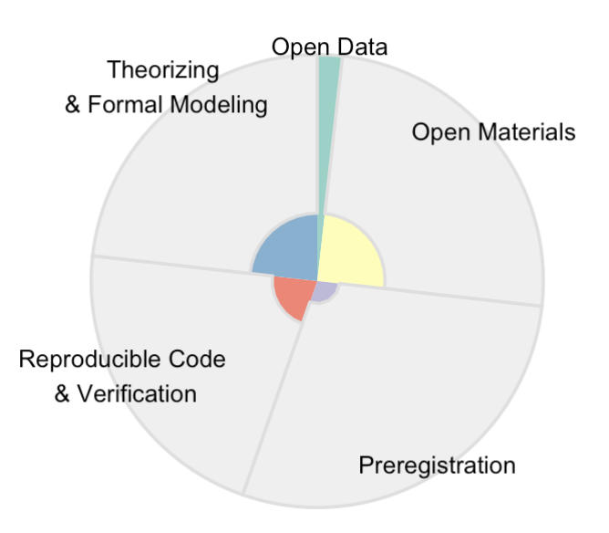
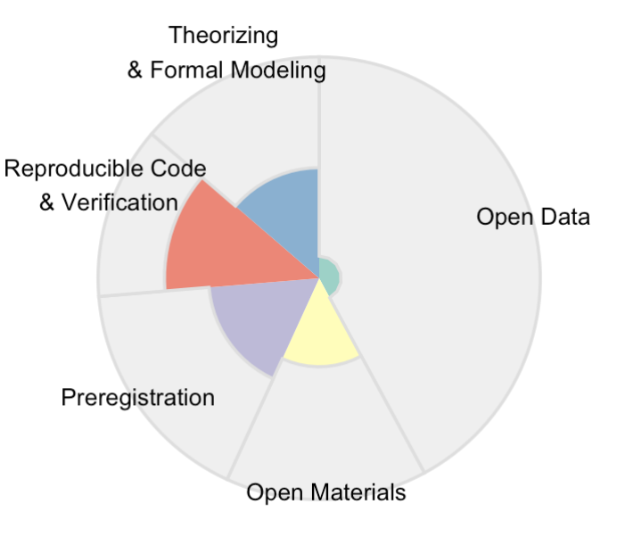
Interpretation of the RRS radarchart
The radar chart helps you to see how many quality indicators have been fulfilled in multiple areas of methodological rigor.
- The width of each sector corresponds to the maximal number of rigor points one could gain. If you often opt-out of certain indicators, then the maximal points get reduced and the sector gets more narrow.
- The colored part of each sector shows the achieved rigor points.
In the following examples, we will focus on the Open Data sector of the radar charts.
The weighted radarchart (with sectors of differing width) is produced in the report of the Profile Builder. While entering data in the Collector App, you currently only see a radarchart with equally sized sectors in the top right corner.
Configuration 1: “Rarely do it - but when we do it, we do it the right way.”
This candidate had nearly no chance to gain open data points, indicated by the very narrow sector. For example, he submitted many methodological/purely theoretical papers which had no data, or had convincing justifications that the data strictly could not be openly released.
But in the few cases where he could provide open data, he did it in a perfect way (i.e., according to all FAIR criteria and other indicators related to open data): The narrow sector has 100% of points.
Configuration 2: “Missed chances: You could have been better.”
In this profile, a lot of open data points could have been gained: The Open Data sector is very broad. But only very few of these potential points have actually been gained.
Configuration 3: “Demonstrating expertise: A lot of potential that has been realized”
This candidate had many opportunities of providing open data (the sector is very broad), and she did it in an excellent way. This is true expertise: Having both a lot of experience and doing it in a proper way.

Summary
The chart shows both the quantity of points that could have been gained, and the quality of the practice. If you are looking for a candidate that has a lot of experience in a certain skill and does it in a good way, the respective sector should be both broad and filled.